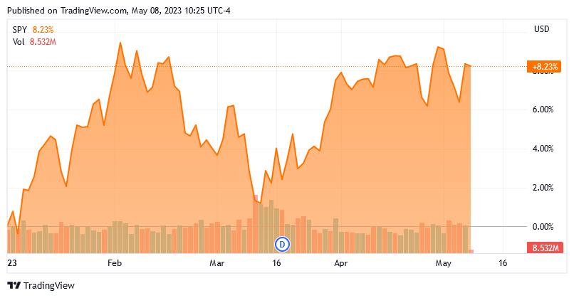
A few months ago, I published an article on this site that showed how the American stock market appears to be overvalued at its current level. That continues to be the case today and in fact, by some measures, the problem is now worse than it was earlier in the year. After all, the S&P 500 (SPY) is up by 8.22% year-to-date:
However, the fundamentals of the American economy have not gotten any better. I have discussed this in a variety of previous articles, such as these:
- The Jobs Data Continues To Get Worse
- Further Evidence Mounts That Casts Doubt On Employment Strength
- The U.S. Consumer Is Hitting A Brick Wall, Negatively Impacting Discretionary Stocks
- Signs Of A Worsening Jobs Market
- Inflation Is Higher Than You Think
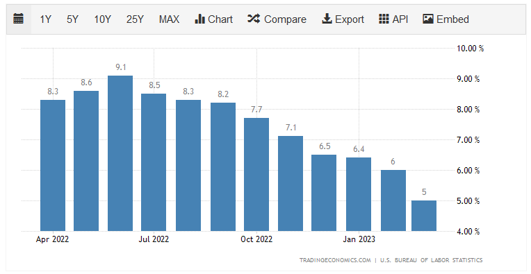
In addition to a worsening jobs market, which is not reflected in the official data for some reason, inflation continues to run hot as the consumer price index has posted 6% year-over-year growth in eleven of the past twelve months:
Finally, the M2 money supply has begun to decline for the first time in decades:

This is indicative of a tightening credit environment, which will severely and adversely impact growth in the United States going forward. The fact that the Federal Government refuses to address the high national debt and deficit problem in the United States is yet another drag on forward growth, as various studies have revealed. Thus, it seems almost nonsensical that the country will deliver forward growth that is anywhere close to that of the past, yet the market continues to ignore that fact as we will shortly see.
Total Market Cap-to-GDP Ratio
One metric that is sometimes used to analyze market valuations is the total market cap-to-GDP ratio. This ratio is not one that we hear about very often in the financial media, which is truly a shame because Warren Buffett once stated that it is “probably the best single measure of where valuations stand at any given moment.” As one would likely guess, this ratio is calculated by taking the total market capitalization of all publicly-traded domestic companies in a nation and comparing them to that nation’s gross domestic product.
As of the close of the market on May 5, 2023 (the most recent date for which data is currently available), the total market index stood at $40.7319 trillion. That is the total market capitalization of all American publicly-traded companies. This is 153.9% of the last reported U.S. gross domestic product. As we can see here, this is actually higher than the ratio that we saw during the Internet bubble in the late 1990s:
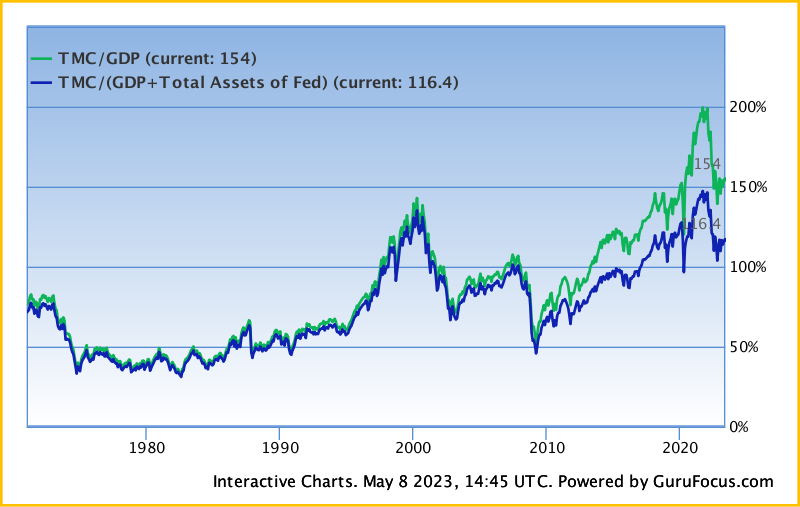
While this is not as high as the ratio that we saw back in 2021, it is still one of the highest valuations in history. It is also substantially above the average valuation for the American stock market, which is roughly 100% based on the past fifty years of data. Historically, every time the ratio exceed 104%, the S&P 500 Index delivered below-average annual returns.
Cyclically-Adjusted Price-to-Earnings Ratio
The total market cap-to-GDP ratio is not the only ratio that we can use to evaluate the current price of the market. One commonly used multiple is the cyclically-adjusted price-to-earnings ratio, which is also known as the Shiller price-to-earnings ratio, after the Nobel Prize Laureate who devised it. This ratio is defined thusly,
The Shiller P/E Ratio is a valuation metric that shows the multiple that the current price of a stock or index is trading over its inflation-adjusted, 10-year average earnings.
Multpl.com
The reason why we use the ten-year average earnings of a company or index is that this smooths out fluctuations in the business cycle. For example, a consumer discretionary company will generally have much higher earnings during an economic boom that causes consumers to have a significant amount of disposable income. The same company will perform poorly during a recession as those same consumers cut back on spending and try to increase their savings.
As of May 4, 2023 (the most recent date for which data is currently available), the S&P 500 Index had a cyclically-adjusted price-to-earnings ratio of 29.14:
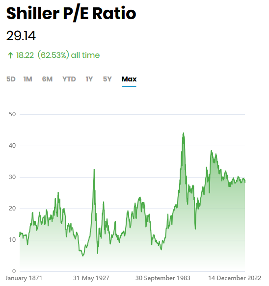
This is above the 26.1 average that the index has had over the past ten years. The average ratio for the S&P 500 Index dating back to 1870 is 16.90, although the average for each decade has generally been increasing over time.
As of right now, the ratio is more than 100% over-extended from the last twenty-year average. Every single time in history that this has happened, there has been a massive market crash at some point. It is important to note that the ratio is not predicting when this crash will happen, nor how severe it will be. However, both this ratio and the total market cap-to-GDP ratio are predicting lower-than-average returns for the S&P 500 Index going forward.
Mega-Cap Technology Stocks
With that said all stocks have not been equal so far this year. One thing that many market watchers are noting is that the overwhelming majority of the total return of the S&P 500 Index this year has been due to a handful of technology stocks. This has been the case for a while, as I pointed out in both 2018 and 2020. I am hardly alone in pointing out that an outsized percentage of the total returns of the S&P 500 Index over the past decade have been due to a small number of stocks:
- Microsoft (MSFT)
- Apple (AAPL)
- Alphabet (GOOG)
- Meta Platforms (META)
- nVidia (NVDA)
- Tesla (TSLA)
- Amazon.com (AMZN)
There are maybe one or two others, but for the most part, an outsized proportion of the S&P 500 Index’s total returns have been due to a few large technology companies. This is the case so far this year as well, as evidenced by the fact that Apple and Microsoft’s weightings in the S&P 500 Index just recently hit an all-time high. Meanwhile, the Russell Microcap Index just fell to a multi-year low.
I have seen a few members of the investment community state that many of these companies continue to look cheap despite their recent outperformance. However, this is certainly not the case. As of the time of writing, the five largest companies in the NASDAQ 100 Index are trading at 65 times free cash flow, which is very close to a record high:
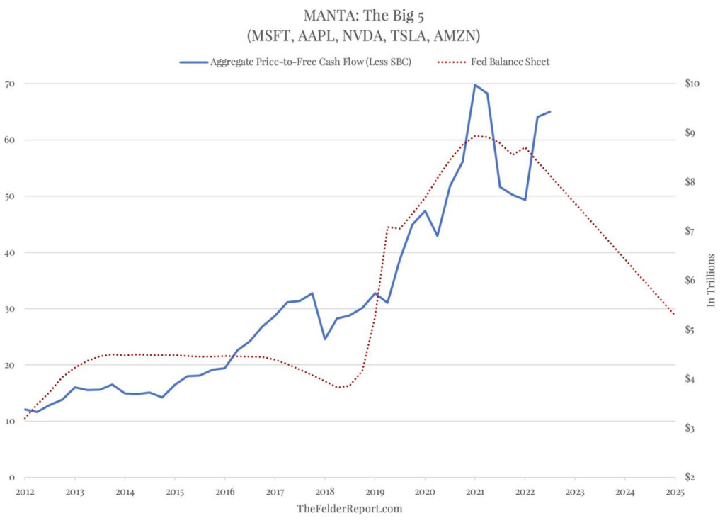
As I have pointed out in numerous previous articles, free cash flow is the money that is generated by a company’s ordinary operations after it pays all of its bills and makes all necessary capital expenditures. This is therefore the money that is available to reward the shareholders through buybacks, debt reduction, or dividends. It is therefore the best metric to use when valuing a company for investment purposes. As we can clearly see, most of the major technology companies are trading at some of the highest prices that we have ever seen. As these companies account for a sizable and growing percentage of the S&P 500 Index, the market is most certainly not cheap at today’s levels.
Conclusion
In conclusion, the S&P 500 Index continues to look incredibly expensive at its current level, mostly due to investor demand for a handful of large technology companies. We can, fortunately, make the argument that certain sectors are reasonably cheap. For example, traditional energy companies appear to be undervalued relative to their forward growth potential. However, buying the index inevitably means that you are overpaying for a significant percentage of the index and will quite likely end up with inferior returns.
Disclosure: I am long various index funds that own several of the stocks mentioned in this article. I do not have any control over the individual holdings of these funds, nor do I directly hold any of the individual stocks that are mentioned.
